YouTube have recently updated its iconic Logo and UI design for mobile App. It is observed that this is the biggest change the YouTube logo has received over the years, as earlier changes were minor tweaks.
Also, the mobile app now don’t have a red banner on top, the navigation is moved to the bottom, and have more white space which looks clean and expected to give better user experience.
For the user sentiment analysis around this update, we used our social media marketing software, myRosys, and below are the results.
Word Cloud: We found lots of buzz on social media around the keyword and prominent words used are #youtube, #branding, #design, #youtubeupdate, etc.

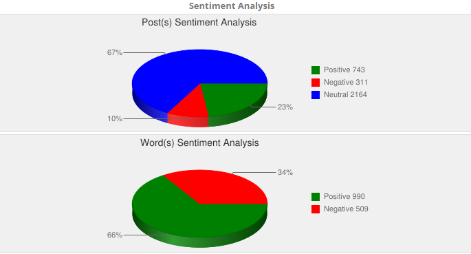
Sentiment: As per the post(s) sentiment analysis, majority of the people were with neutral reactions. For the word sentiment, users seem to be using positive words in their communication on social media platforms.
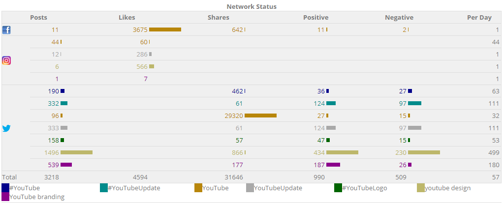
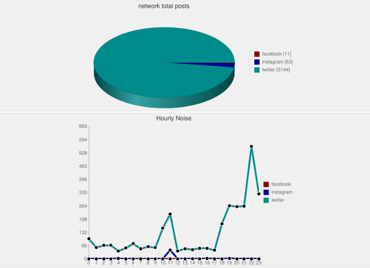
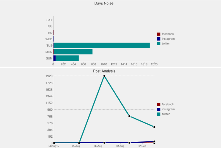
Noise: Below is a summary of noise that occurred on different social media networks for the trending keywords. As could be seen from the hourly noise graph, the noise spiked high with the run-up during tweet hours.
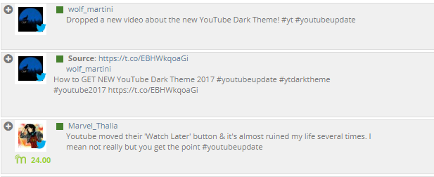
+ve Sentiments: Out of much talked about topic, myRosys identified top positive views of people shared on social media.


-ve Sentiments: myRosys also identified top negative views of people shared on social media about the keyword content marketing.
The user sentiment clearly shows that YouTube platform is a power player in the industry with much fan base on social media networks.
Leave a Reply