In an effort to better cater to newcomers, Twitter rolled out a new UI design today. As part of the redesign, profile icons are now round instead of square, the reply icon is reflected by a chat bubble, and likes and retweets are shown in real time in the app. Also, Twitter’s latest redesign makes the iOS app look more like Android.
As noticed by the Twitter-ers, the new look is strikingly similar to Instagram’s big black-and-white update from last year, cutting out a piece of Twitter’s trademark blue-and-white design. Some people made fun at some of the changes, while others lamented the update’s lack of an “edit tweet” button.
We used our social media marketing software, myRosys, to analyze the user sentiments on latest update in social media space and here are the results:
Word Cloud: We found lots of buzz on social media around the keyword and prominent words used are #twitter, #twitterupdate, @twitter, #ios, #twitterui, etc.
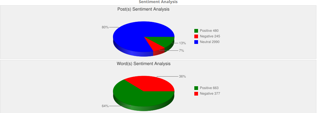
Sentiment: As per the sentiment analysis of posts, majority of the people were with neutral reactions. For the word sentiment, users seem to be using positive words in their communication on social platforms.
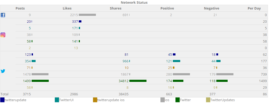
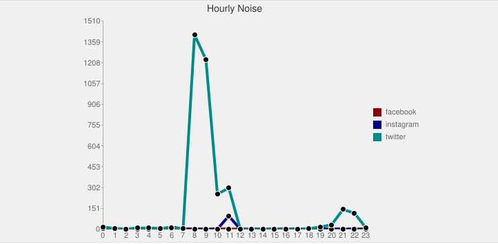
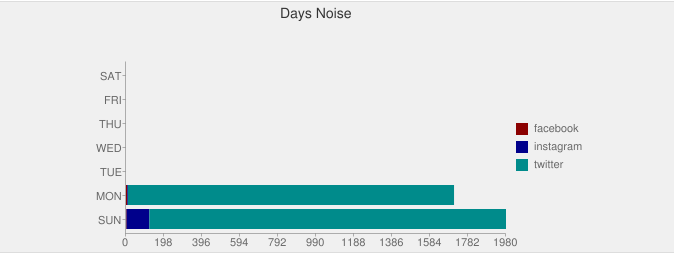
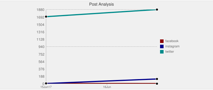
Noise: Below is a summary of noise that occurred on different social media networks for the trending keywords. As could be seen from the hourly noise graph, the noise spiked high with the run-up during tweet hours.

+ve Sentiments: Out of much talked about topic, myRosys identified top positive views of people shared on social media.

Going by the user sentiments and buzz on social media platforms, most of the twitterati seem to be not-so-impressed with the latest UI update. Twitterati longing to see an “EDIT” option on the platform, were again left disappointed.
Leave a Reply